Threshold Care
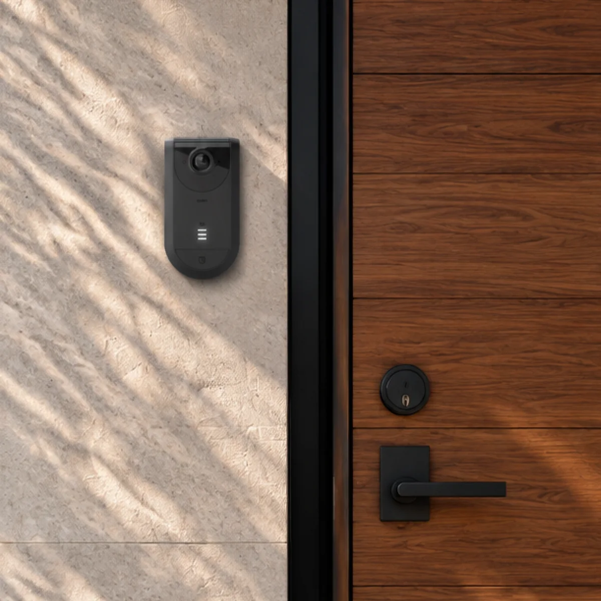
Dashboard redesign. A WiFi-based motion sensing system that helps families stay connected with elderly or independently living loved ones, no cameras, no privacy invasion, just meaningful presence data.
Overview
Threshold Care is a WiFi-based motion sensing system designed to help families stay connected with elderly or independently living loved ones, no cameras, no privacy invasion, just meaningful presence data. The app lets caregivers quietly monitor daily routines and get alerted when something seems off.
The Problem
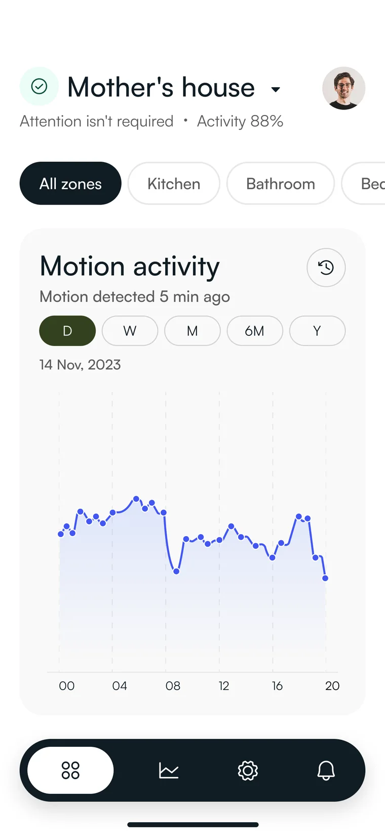
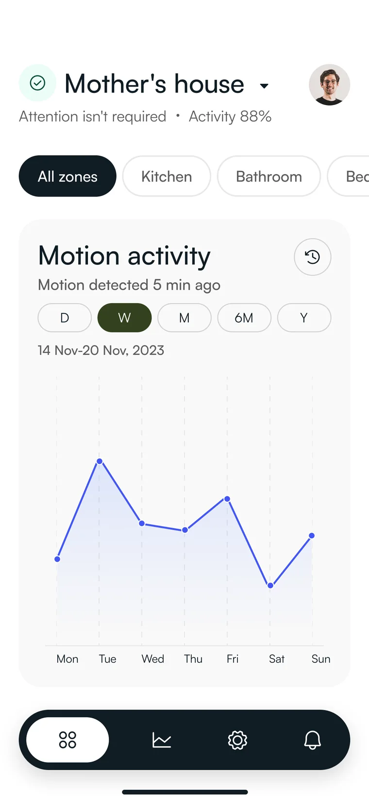
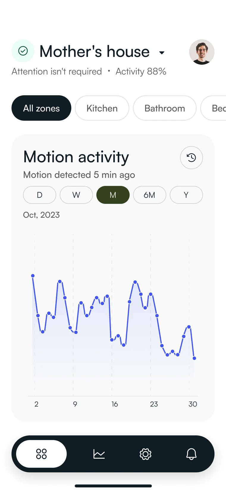
The existing dashboard displayed raw motion data as a simple line graph. Users had no way of understanding what they were looking at, what the data meant, or whether they should be concerned. The data was there, but the meaning wasn’t.
Process
What we did
Working closely with the Project Manager, we redesigned the dashboard from the ground up. Our key design decisions:
Split the day in two
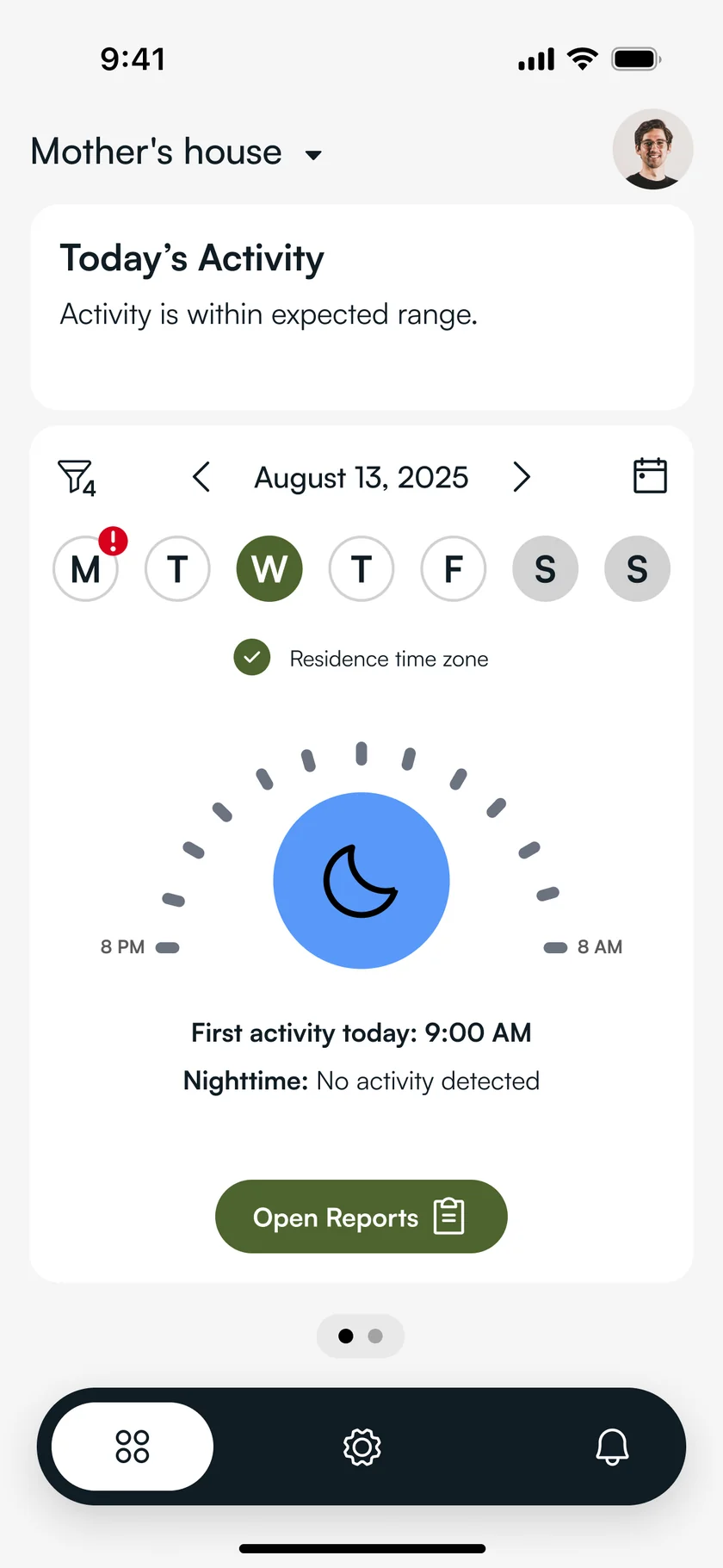
We divided the dashboard into daytime and nighttime views, giving users a clear, separate picture of their loved one’s activity patterns throughout the day and night.
Made data human
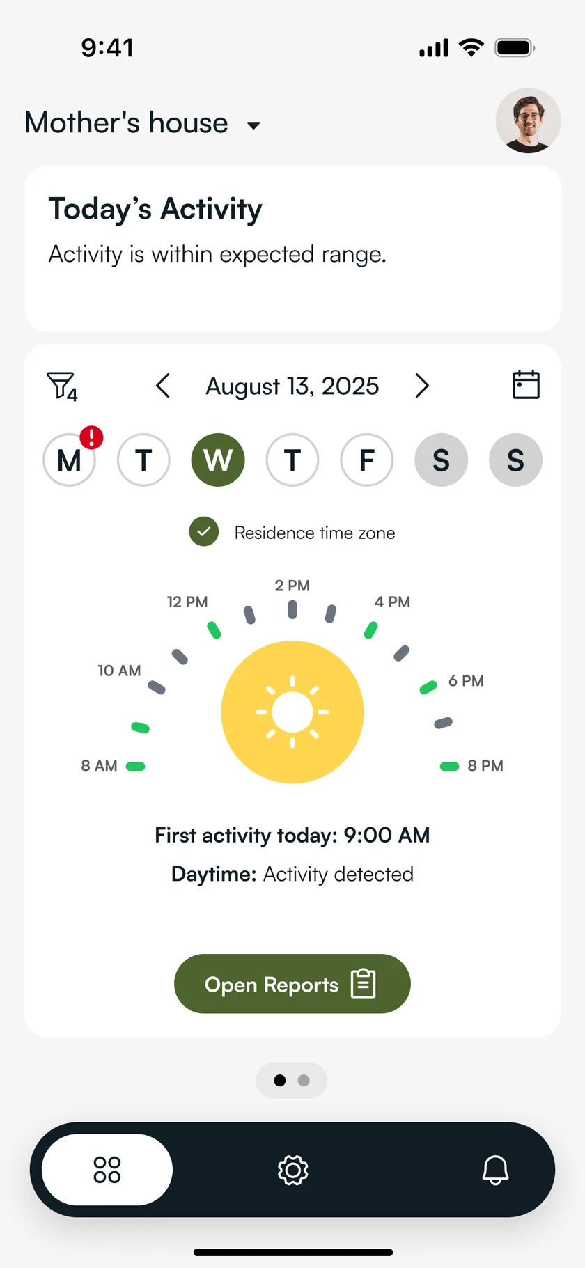
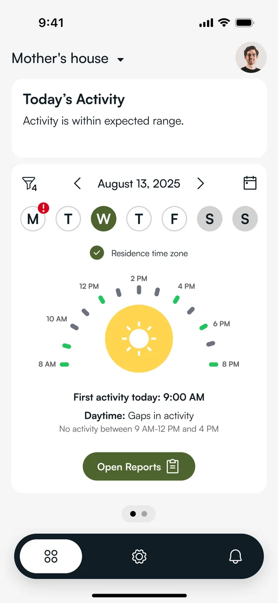
Instead of a raw graph, we introduced a circular time-based visualization that breaks the day into segments. Active and inactive periods are visible at a glance.
Proof
Three scenarios
The same dashboard, reading three different days. A design that only works on a good day is not finished.
Normal day & night
The baseline. “Activity is within expected range.” Daytime shows activity detected, nighttime shows none, and the dashboard simply confirms that nothing needs attention.
Less daytime motion
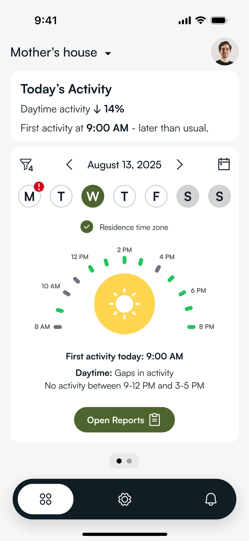
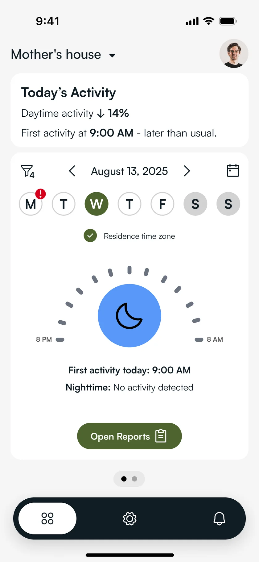
Daytime activity down 14%, first activity at 9:00 AM, later than usual. The dial shows gaps between 9-12 and 3-5 PM, and the summary says what changed, in words.
More active than usual
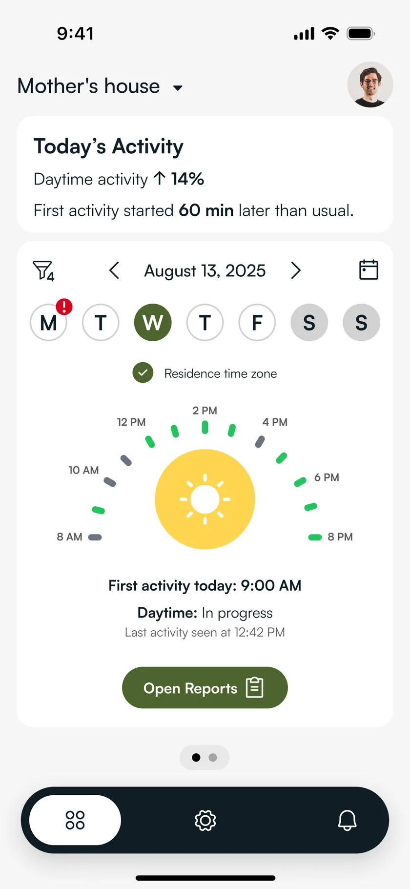
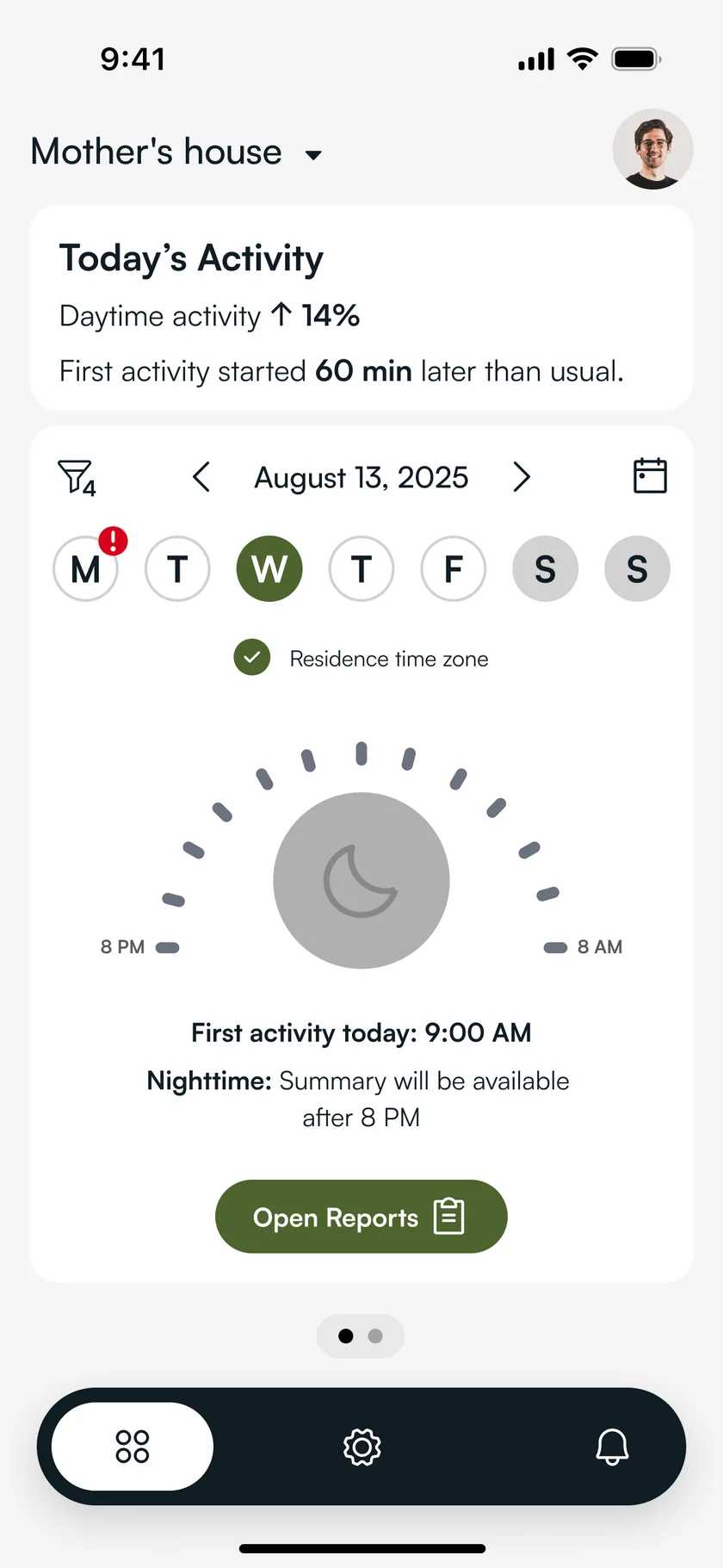
Daytime activity up 14%, first activity 60 minutes later than usual. The day is still in progress, so the night view waits rather than guessing: “Summary will be available after 8 PM.”
Surfaced the daily summary
We added plain-language summaries like “First activity at 9:00 AM, later than usual” so users can understand the situation without interpreting numbers.
Morning Check-in
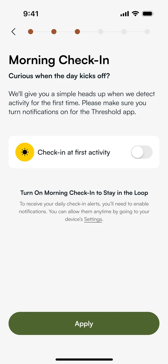
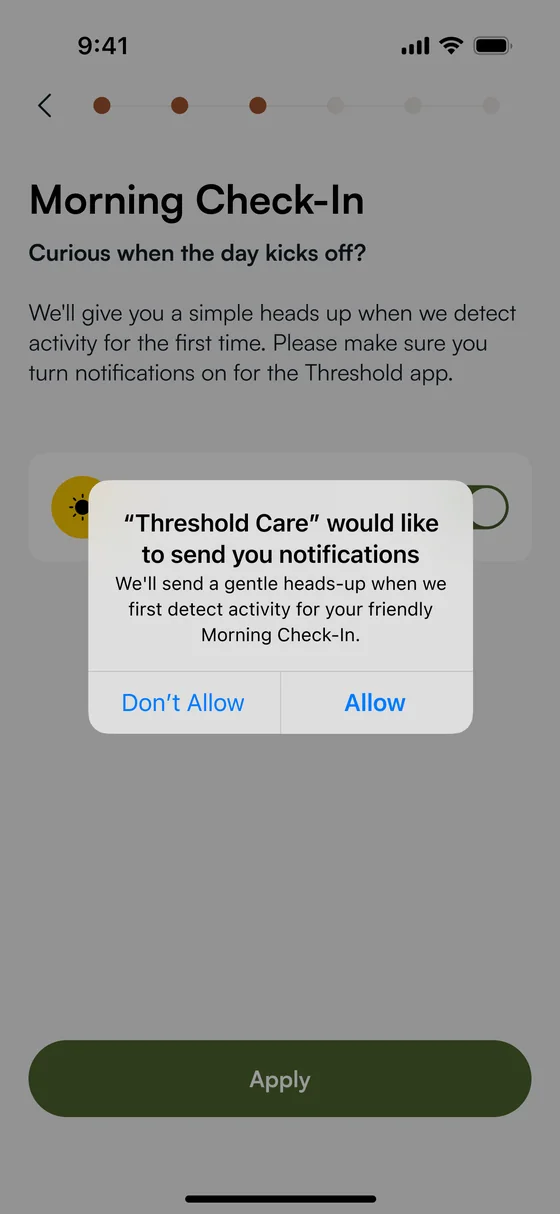
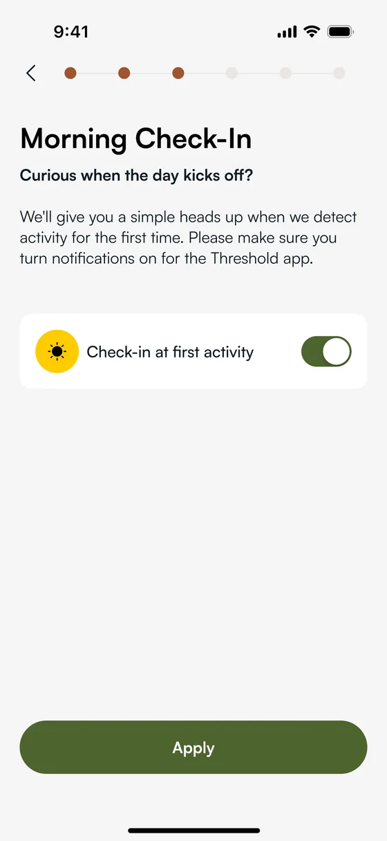
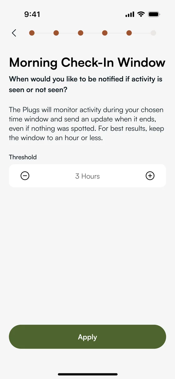
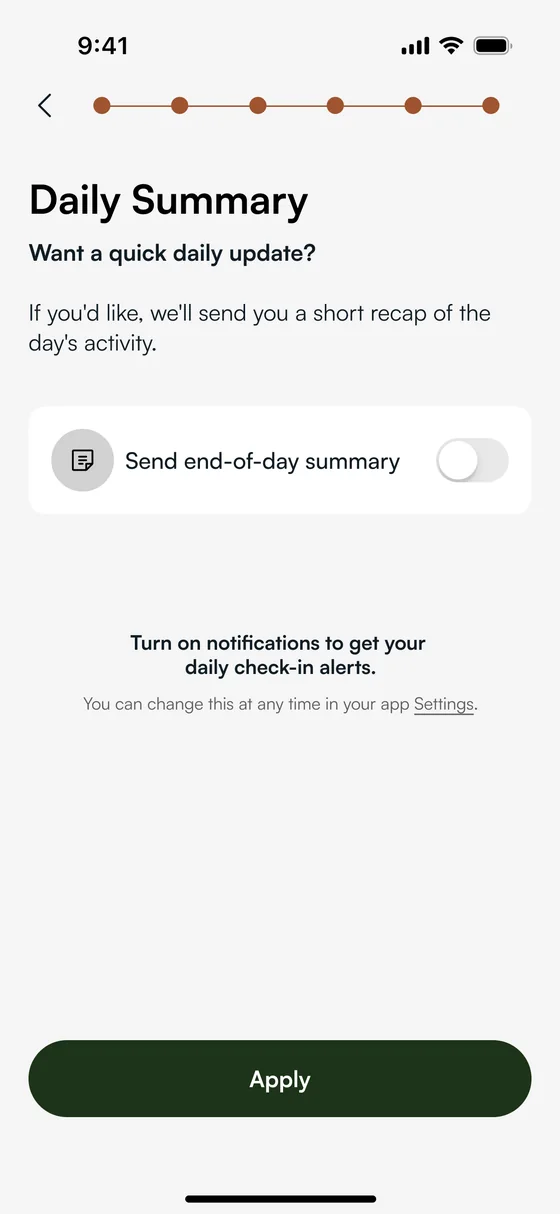
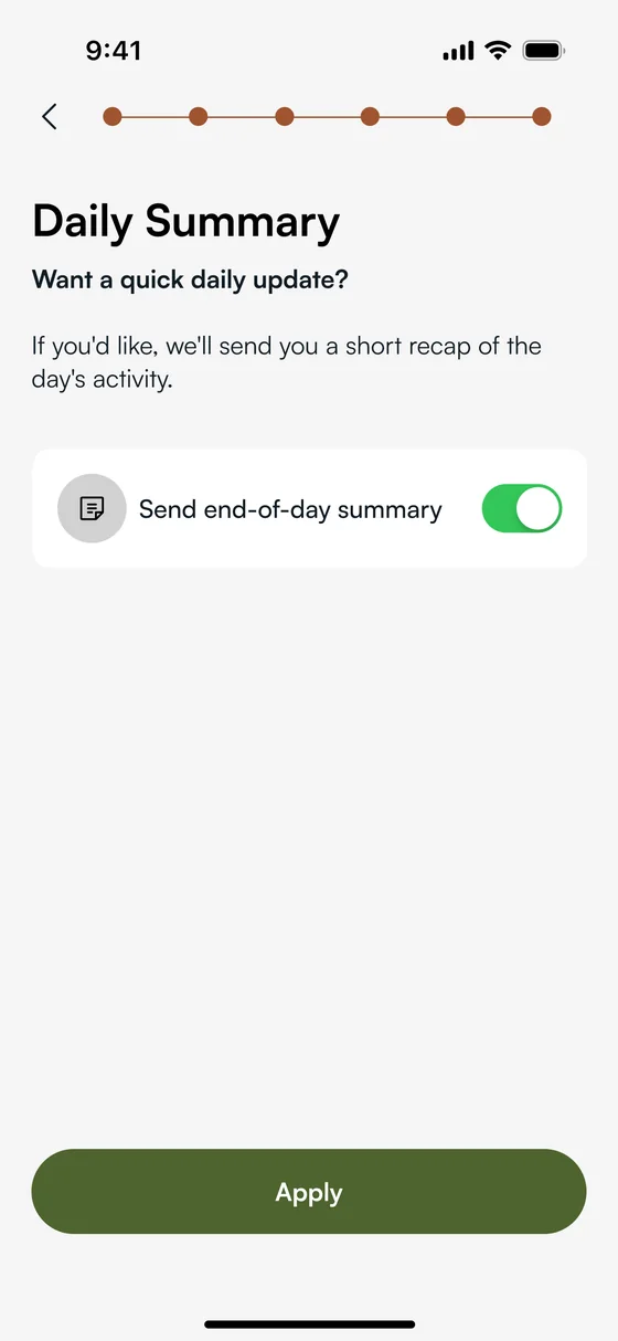
A new feature that starts the day with a digestible summary, integrating naturally into the caregiver’s morning routine. Separate flows were designed for new and existing users; the existing-user path is shown below.
Outcome
We transformed complex sensor data into an emotionally meaningful, instantly understandable experience. Instead of reading charts, users can now simply feel whether their loved one is doing okay.
Threshold Care is a product of Threshold Care Inc. Screens, artwork and brand assets © Threshold Care Inc. All rights reserved, shown here as a record of my design work.
All projects